Apples
Asparagus
Bananas
Blackberries
Cherries
Clementines
Cranberries
Grapefruit
Grapes
Guava
Kiwifruit
Lemons
Limes
Nectarines
Oranges
Peaches
Pears
Plums
Raspberries
Strawberries
Fruit in Charts: The winners and losers of 2018 (Part 1 of 3)
By
| 15 January 2019

To introduce a brand new function on our website and celebrate the new year, we have compiled our entire data set to see what commodities are the biggest winners and losers of 2018. To give a bit of a longer-term perspective, we even went back nine years to measure which commodities have had the best performance.
The most stable data we have are what the USDA calls Shipping Point prices which in reality represents domestic shipping point and Port of Entry for imported produce. Generally speaking, these are collected in a pretty standardized way every day giving us relatively clean data to work with. To get the best idea of how each commodity has performed against the others we standardized the prices to USD per kilo which minimizes the variance that could be created by different commercial formats.
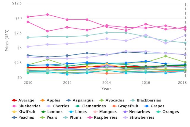
The end result is pretty interesting. In the chart below you can make out the berries at the top of the chart with the highest prices, followed by a big mix of everything else right after. You can use the link under the chart to see this report in Agronometrics which allows you to interact with the data in much more detail.
Average Yearly Prices by Commodity (USD per KG)
(Source: USDA Market News via Agronometrics)
[Agronometrics users can view this chart with live updates here]
[Agronometrics users can view this chart with live updates here]
In the table below we can see the ranking of commodities by percentage of growth, which offers some good insights when considering the commercialization of the fruit the data set is trying to represent. The biggest price increases are far and away limes and cherries, both of which saw huge jumps compared to the previous year. Plums, peaches and avocados were the biggest losers, having taken equally dramatic falls from the previous year’s growth.
In bold, the commodity “All” represents the average of all prices we have in Agronometrics, which shows that prices, as a whole, have dropped 8.34%, making all of those commodities that have at the very least maintained their level quite attractive.
To read this chart, keep in mind that 100% equals the same price as last year, where anything above is growth and anything below is loss.
Shipping Point Yearly Percentage Growth by Commodity
| Rank | Commodity | 2017 | 2018 | Change |
| 1 | Limes | 89.63% | 130.77% | 41.14% |
| 2 | Cherries | 80.43% | 123.22% | 42.80% |
| 3 | Kiwifruit | 112.51% | 105.28% | -7.23% |
| 4 | Raspberries | 90.45% | 104.11% | 13.65% |
| 5 | Lemons | 119.12% | 100.16% | -18.96% |
| 6 | Mangoes | 101.67% | 100.10% | -1.58% |
| 7 | Oranges | 123.51% | 99.38% | -24.12% |
| 8 | Grapefruit | 107.66% | 98.53% | -9.13% |
| 9 | Apples | 93.17% | 97.74% | 4.57% |
| 10 | Pears | 98.56% | 97.51% | -1.05% |
| 11 | Grapes | 84.15% | 96.46% | 12.31% |
| 12 | Clementines | 110.78% | 96.15% | -14.63% |
| 13 | Strawberries | 93.24% | 95.78% | 2.54% |
| 14 | Blackberries | 90.40% | 94.11% | 3.71% |
| 15 | All | 102.35% | 94.01% | -8.34% |
| 16 | Asparagus | 100.42% | 93.30% | -7.12% |
| 17 | Blueberries | 104.74% | 92.59% | -12.15% |
| 18 | Nectarines | 116.68% | 92.28% | -24.40% |
| 19 | Plums | 141.71% | 90.60% | -51.10% |
| 20 | Peaches | 119.51% | 85.98% | -33.52% |
| 21 | Avocados | 138.44% | 72.06% | -66.38% |
Seeing the massive amount of variance that is observed year to year, it is reasonable to say that yearly percentage growth might not be the best indicator of overall attractiveness of a commodity. I believe this to be particularly true in agriculture, given that planting new crops requires longer investment periods with which to begin seeing returns, so I expanded the study to observe average yearly growth for the last 8 years. As a point of reference I offer the same calculation for 2017 as well.
The table below paints a much rosier picture of the market showing that even though last year was a low average price, over the last 8 years prices have mostly remained stable with most commodities increasing in price.
The biggest winners overall are lemons and plums, with an honorable mention going to limes which increased their eight-year average by a considerable 4%. On the other hand, clementines and blackberries have gotten the cheapest for consumers over the last eight years. Avocados had the most dramatic drop in price, losing their position at the top of last year’s list to near the bottom of this year’s.
Shipping Point Yearly Percentage Growth by Commodity
|
This information is all well and good, however, as you might have been able to tell from the title, the story isn’t quite over yet. A major component of how and why prices move the way they do can be found in the volumes, which we will look at in our next article.


