Automatic Chart Titles Become a Part of Agronometrics Data Service
By
| 19 January 2022
Automatic chart titles have recently been integrated into Agronometrics Explore Data Service. By virtue of this newly added feature, chart titles that describe the data being shown will automatically accompany all of the charts that can be generated within each data set.
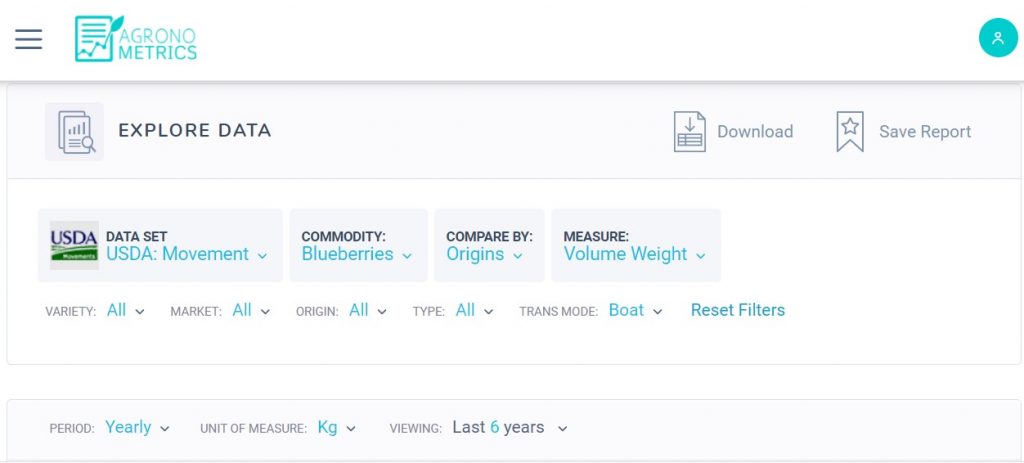
The data in the service is classified according to the name of the commodity, period, variety, market, origin, type, transportation mode and measure. Additionally, users can indicate the factor by which they want their data to be compared.
The following is a case in point:
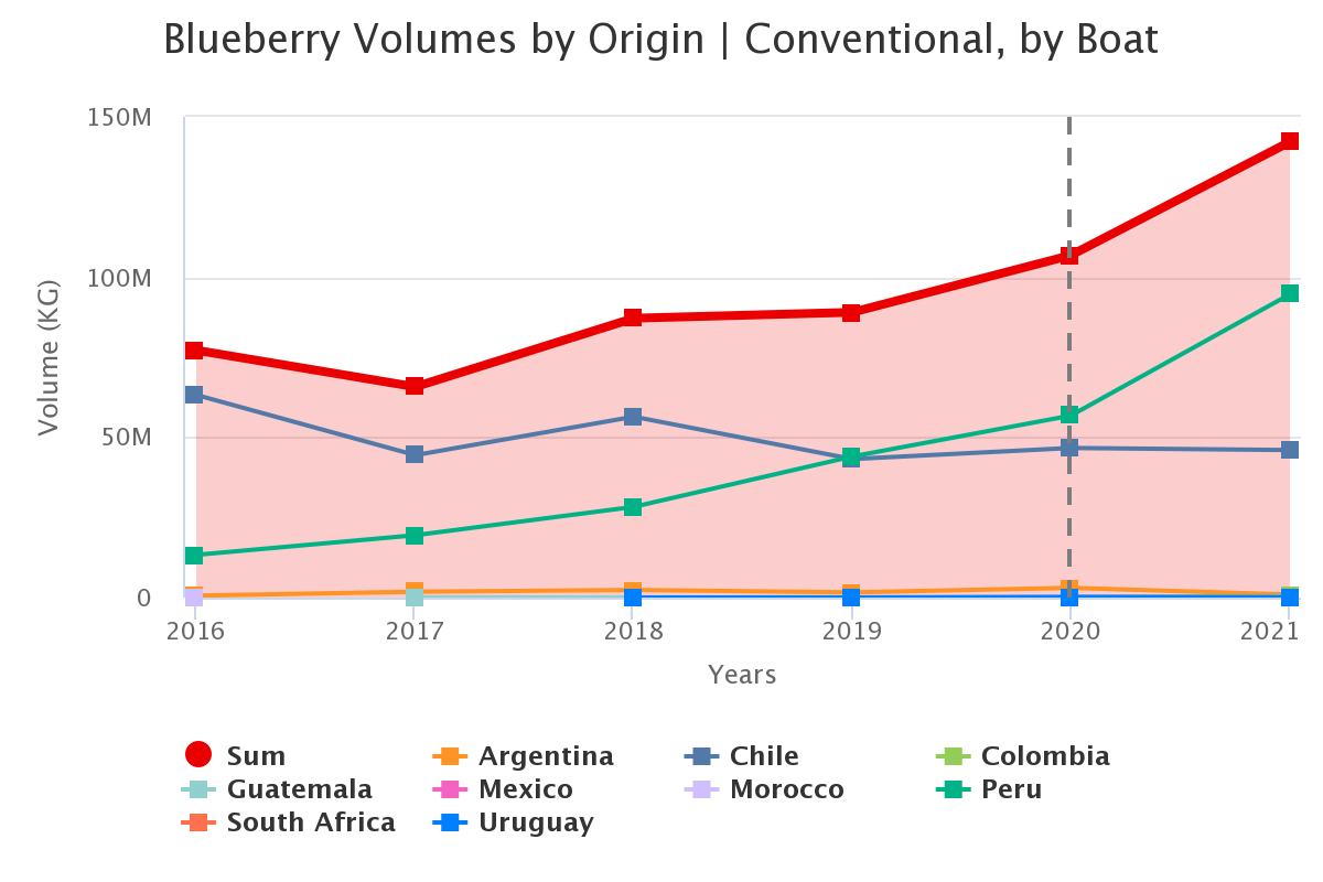
The user in this scenario selects Blueberries as the commodity from the USDA: Movement dataset and decides to compare the data by origin. The user goes on to filter the data, selecting the transportation mode as ‘Boat’. In this scenario, the period is set to ‘yearly’ and data from the last six years is viewed. The unit of measure in this case is ‘kg’.
Agronometrics Data Explorer Tool
After making the aforementioned selections, the user is able to get the following graph as the output.
The aim of this newly integrated feature has been to standardize chart nomenclature for the ease of our users. This feature will, in addition, make it easier to compare different charts since the differences between each will be able to be tracked conveniently.
This new service has been made automatically available for all of our subscription holders and is also available during the initial two week free trial of our service. Users who have an expired trial account and would like to test this new feature are welcome to contact us in order to receive an extension for the trial.